Designer objects, furniture, textiles, colorful walls: the Pantone 2020 color reigns supreme in domestic spaces, but how do you best decorate your home with Classic Blue? We at Pari Cucine will tell you, because in Rimini we're adept at finding perfect combinations for different furnishing and design styles. Blue isn't just synonymous with nautical style, but also with a modern and contemporary living area that deserves stylish furnishing, and this rule applies to every other room in the house.
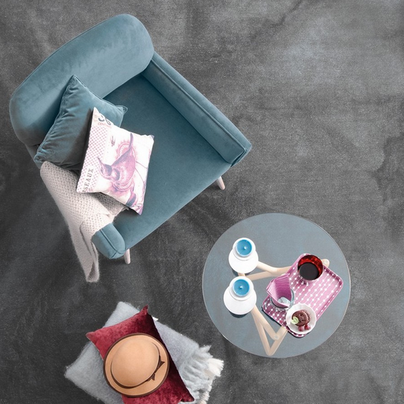
Living room furniture in Rimini with Classic Blue Pantone
Like every year, the Pantone Institute identifies and guides trends in hues and palettes, and has chosen its
classic, comforting, and instantly recognizable blue 19-4052 . This is the world's most famous color scale, created by the American company, a pop icon for designers, architects, and graphic designers, which has now become an undisputed benchmark for universal color classification. The Pantone chart is hailed every year as the true key to creating the most fashionable and trend-setting color combinations, both in fashion and interior design.
As a furniture store with several showrooms in Italy and an excellent online store, we at Arredamento Pari Cucine in Rimini asked ourselves a question: how can Pantone Classic Bue be used in home furnishings? In the fashion world, designers, especially Alberta Ferretti, have been pioneering it on the runway, and we were all surprised to discover that it's a warm, deep color that's, above all, easy to match.
It's nothing like a simple blue or light blue that can be worn by those who love Frozen, for example. The inspiration for Classic Blue comes from the historical period we're living in, which, as
Leatrice Eiseman , Executive Director of the Pantone Color Institute, explained, requires trust and faith. For this reason, a solid blue, like that of the seas and oceans, but also of the sky just after sunset, is a shade that, even though it's part of the cool color range, warms the heart, relaxes, and recharges. What's better than a walk on the shore, gazing at the sea in winter?
For this reason, the most important
home and interior design magazines and blogs consider the Pantone 2020 color to be a neutral and capable of replacing black and white.
A prediction could never have been more accurate, given that our Scandinavian colleagues are starting to use it liberally! It's clear there's a lot of interest in incorporating this palette into interiors, but thanks to design objects, furniture, textiles, and—why not?—colored walls, we can play with blue.
Rimini: How to decorate your home with the 2020 Pantone color.
If you're starting to plan a space redesign and want to add that extra touch of character to reflect your personality and stay on trend, Classic Blue is the perfect color! The walls of a specific room will certainly be a great place to incorporate this unique color. In fact, painting a specific room can make its intended use clear at a glance. Paint can also emphasize a specific corner of a wall, highlight a piece of furniture or a decorative accessory, or give the space a fresh, new feel, without requiring any major renovations.
Furthermore, the choice of flooring can also be excellent for enhancing the overall look: the Pantone 2020 color pairs beautifully with
wood. Choosing the right color for the walls is anything but simple and straightforward, so those who follow trends and dive right in should take a deep breath and wait. The wrong shade could irreparably compromise everything. This situation isn't saved even by furniture and accessories from major Italian brands and artisans, of which we are official retailers. This particular shade of blue lends a profound sense of peace and tranquility to all spaces where it's used, both in private homes and commercial spaces.
Even if the blue palette is rarely used, it's perfect for restaurant or lounge bar rooms, as blue and light blue are said to suppress appetite. Classic Blue, however, has the ability to foster communication, so even in a doctor's office it could be a panacea for conveying trust and serenity, as well as for a chat while waiting for your turn. In our opinion, a study, bathroom, living area, or bedroom are the most suitable rooms in a private home.
A child's bedroom could particularly benefit, as blue also has the ability to increase concentration. Spread across a wall and used thoughtfully, it could be very helpful in improving children's academic performance. For the relaxation area, many textiles and upholstery are already in Pantone blue. The living room should also be enhanced with rugs, a wall unit, and/or bookcase, all of which can easily be in Pantone blue shades.
Of course, it's a risky choice because it could become boring, but the key is to avoid overdoing it. If the walls are painted blue or the floor is the same shade, it's best to focus on white, neutral furnishings, or furnishings in natural tones like wood, glass, and steel. Otherwise, you could consider a blue sofa or armchairs, or even furniture, as long as they're paired with neutral colors. While blue might pair well with orange tones, creating a strong contrast in a vintage living room, too much color can quickly become boring and create a claustrophobic, rather than airy, feel.
Classic Blue Furniture by Pari Cucine in Rimini
We're absolutely convinced that Classic Blue will remain one of the most iconic Pantone colors and won't go out of style any time soon. At Pari Arredamento in Rimini, we recommend browsing our e-commerce site to help you choose the right furnishing accessories for this distinctive blue, not just for the living room but also for other rooms in the home. Cipì has beautiful bathroom accessories in blue, or those that can be adapted to a Pantone blue, while resin sinks, with an almost woody look, are the perfect addition to any bathroom.
Don't forget about light: this blue is ideal for soft, warm-light atmospheres, conveying a sense of relaxation. The pendant lamps, also by Cipì, are perfect. They're made of chromed steel but can be adapted to any setting, from a bathroom or study to an open-plan space with a kitchenette and living area.
Being comparable to a neutral color,
Pantone Classic Blue 2020 pairs perfectly with black and white: for a contemporary living room, a Midj sofa or armchair with a themed upholstery (choice of faux leather or fabric) could make the existing blue furnishings stand out. If a wall is painted this shade, Spanish brand Nomon can help with its designer wall clocks, which resemble contemporary sculptures, true works of art (in fact, they're entirely handmade). Finally, how could we not consider the kitchen and dining area? While it's true that textiles and furnishing accessories such as soap dishes, clocks, sofa covers, and cushion covers can be changed depending on your mood and the season, chairs and especially kitchen cabinets and base units are permanent fixtures.
Our proposals are appreciated for their elegance, design, and materials, as well as their customizability. With a color like Classic Blue, the ideal countertop is wood, and for those who love two-tones, pairing it with woody shades or steel will add that extra touch. Furthermore, it could ideally separate the cooking area from the living room, as the kitchen will be one color while the living room furnishings are another, preferably neutral or natural. Continuity will be provided by the floors and wall colors, chosen according to the characteristics of the room and the furnishing style.